Hi! My name is Heri, and I’m an aspiring technical artist in charge of our vfx and asset pipeline. I want to share a few tricks we used in Patobox in order to save resources. This entry is going to contain a bit of jargon regarding shaders and concepts like textures, Uvs and game optimization. I’m not going to be very specific about the implementation of each solution, so I recommend being at least familiar with these terms. If you are already an expert, well, maybe you won’t find anything new here.
As a team, Bromio only had experience with mobile gaming; making the jump to consoles was a much desired goal, but with unknown technical challenges. We lacked experience in many areas that would allow us to polish our assets, specifically, particles and shaders.
The first problem we faced was our excessive use of memory. The black and white shading we were using for many assets of the game was drawing a lot of objects twice. The reason? Our artists were using “sub-shaders”; assigning a material directly over the model faces, and exporting that into Unity. Because of it, each material was telling Unity to create two meshes: one for the black faces, and another for the white ones, essentially doubling the amount of objects on the screen.
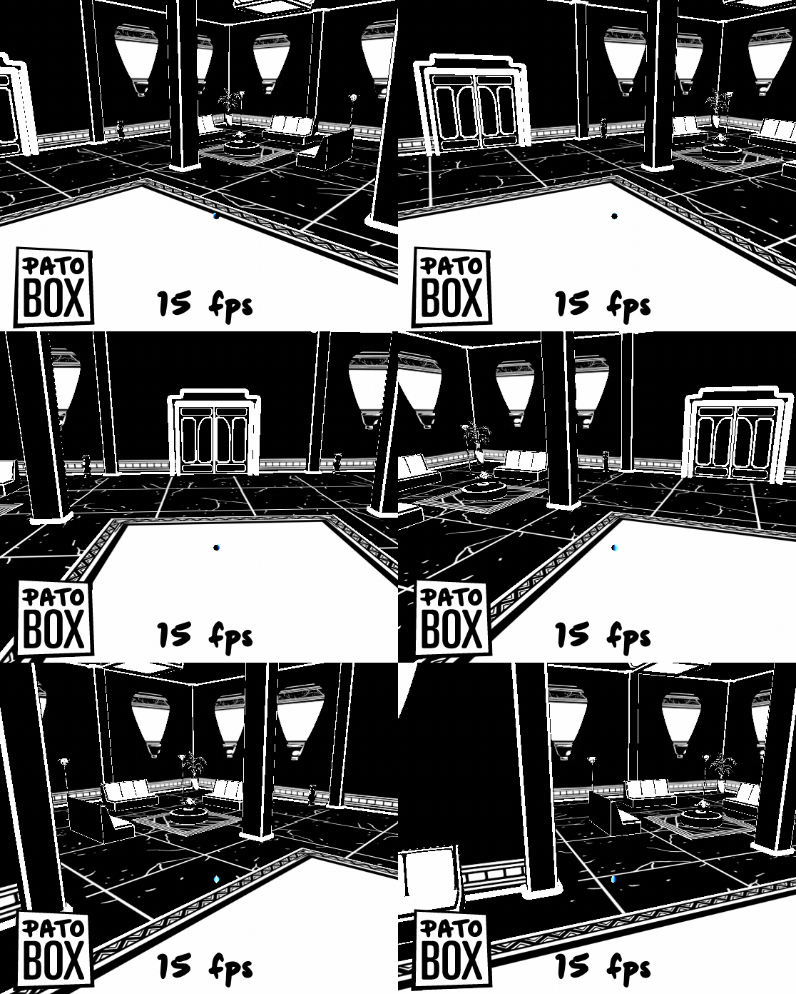
Our fps was around 15 to 10, really hindering the game.
We needed a way to paint the objects without using multiple materials. Using textures was a possible fix, but creating UV’s for all the objects would take some time and, while not a terrible lot, we still wanted a faster solution. We decided to write some custom shaders to fix this and add them to our pipeline. But, the problem was, I had no previous experience with that.
We also didn’t have enough time for me to learn how to write them from scratch, but at least I understood the basic gist of how they worked. We bought a copy of Shader Forge, a plugin for Unity that allows you to create shaders trough nodes. And with a few tutorials, I started to prototype shaders for our project.
The first shader implemented was a solution for our original problem, the double mesh draw. Our artists started to use vertex colors to set how the assets looked, and it worked pretty nicely. Unity doesn’t have a shader that displays vertex colors, so I created one quickly. It was not hard at all thanks to Shader Forge (I can’t stress this enough, this tool saved our lives). After displaying the vertex colors, we used another property to add a thin outline. To test how the asset looks in game, I added a few properties to invert the vertex colors, and choose the color of the outline. This way, we could test quickly how our assets create contrast in our levels, and change anything quickly without asking the artist to invert the colors in the original asset.
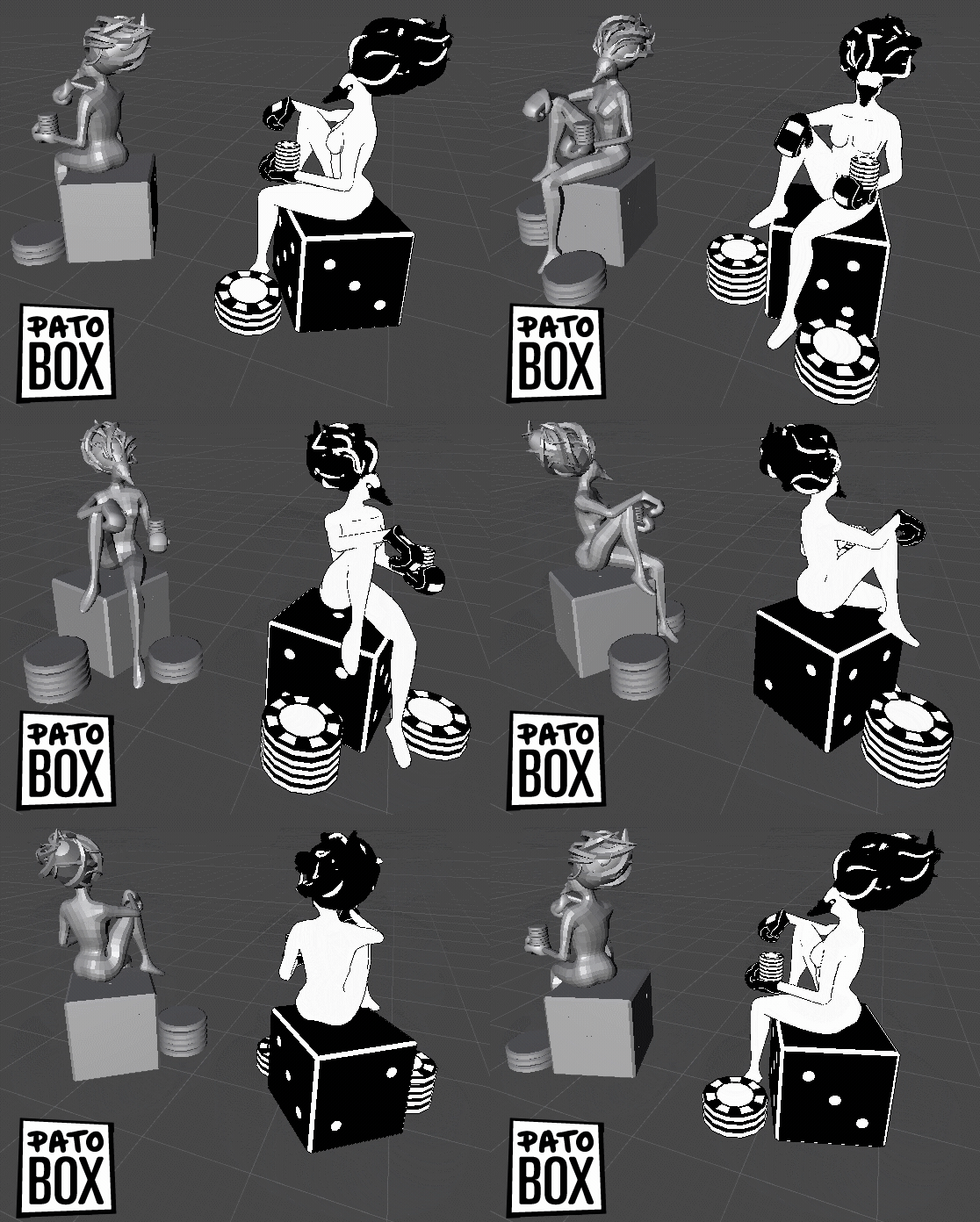
This, naturally, reduced the resources we used in the project (fps went through the roof!), and gave freedom to everyone working on the assets; it didn’t matter which color you picked to paint it: just create a nice contrast, and if changes were needed the shader would handle it for us, with one simple click.
As the game progressed, many assets required more than just color contrast; they needed textures. This was, of course, something we didn’t want to waste time on, but once we reached the casino level, the need was clear. If we want to keep our game UI free, many things would need at least some texturing.
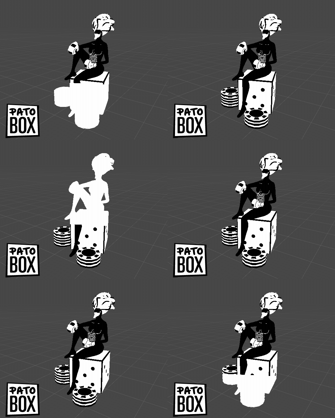
So, to keep the advantages in our current pipeline (not having to worry about Uv’s, confidently painting assets knowing you can make changes quickly on the fly), I prototyped another shader. This one reads the vertex color information from red, green and blue vertices and outputs black, white and textured. How so? Our artists, instead of painting the assets black and white as they normally would do, painted them red and green. Anything red would be interpreted as black, and greens as white. This way they could still “not worry about which color you pick” because it was essentially the same thing, and just add blue to the things that would have some textures. Sadly, for the textures, there was no way around the UV mapping. But to keep it simple, we divided the texture into many squares, and the UV’s didn’t have to be complex: you just need to place the square in the right place of the texture.
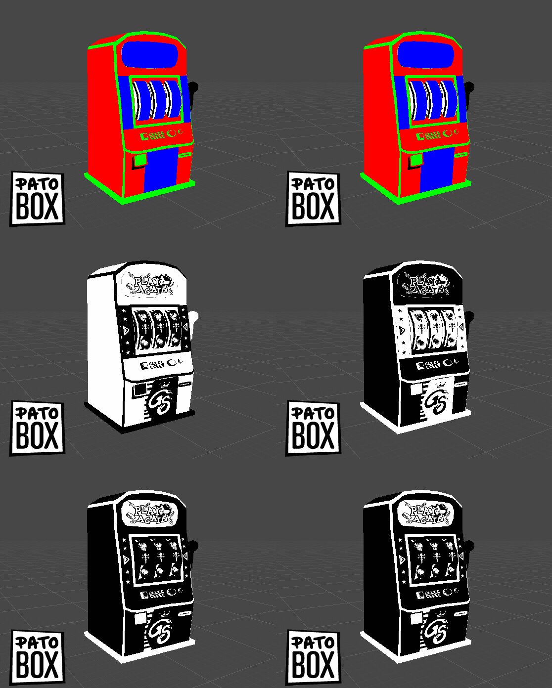
How it really looks, and how is interpreted.
We still had another problem. This gave us textures, sure, but not transparency. So, I changed the shader to pick the transparency from the texture, then apply that to anything that was painted blue. And it worked well!
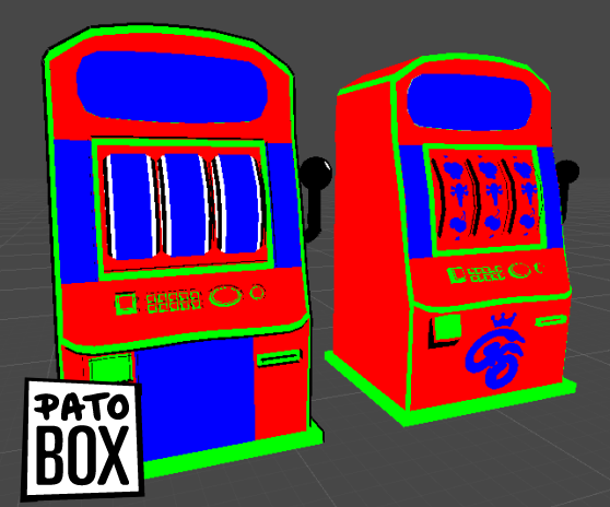
Notice how the right asset gets the detail
That solved the problem with the assets, but what about the walls, the floor and the ceilings? They already had textures (uv mapped quickly with simple planar projections) but adding details to them could be a bit costly. We would need one texture for the wall, one for the details, and this process for each texture we had. That’s a lot of textures. But, since we are just using black and white textures… we could use that in our favor. Each image saves, independently, a red, green and blue channel. And those are just shades of gray, that together create the final color. So, what if we store our textures in each channel, separately, and the just assign them where we needed? So, for each level, all walls were painted blue, and took the information in the blue channel of our image. Then, some other objects (mostly planes) had the same shader, but were painted green. Those would take the information stored in the green channel. And the transparency? That was extracted from the red. And the we were able to store the texture, the details, and the transparency data, all in one image. That halved our texture calls.
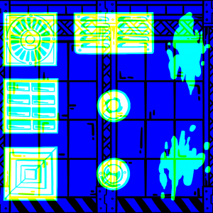
This is how a texture looks in reality.
With those shaders, most of the assets that build each level were solved; we didn’t do lots of calls, the vertex colors were very quick to read, and we could try new colors on the fly. Pretty useful all around.
Shaders solved a lot of technical problems, but were also able to fix a few gameplay issues that we couldn’t solve properly with neither UI nor changing our assets. In particular, we needed to steer the players attention towards key objects in our levels, that could be broken in order to progress. We implemented a visual effect, similar to a scanline, for every key object in the game. It was previously used for everything that could be broken, but that proved to be too distracting for our players.
I could talk about many other shaders and tricks we used for Patobox, like our own material to render 2D sprites for the “shadow fighters” and another for “charged” Patobox, for example. But maybe that would be better suited for another blog post. For now, I would like to offer some closing thoughts: every little time you spent learning about shaders can save you a lot of problems in the long-run. Given the tight schedule we had, finding a tool like Shader Forge allowed me prototype any shaders we needed really quickly, but I still recommend learning proper programming for shaders, since even with Shader Forge we had to rewrite a few things for optimizations sake.
And that’s all for this post! I hope you can get some ideas on how to work with the limitations of your project, and turn that into a chance to add new tools to your pipeline.